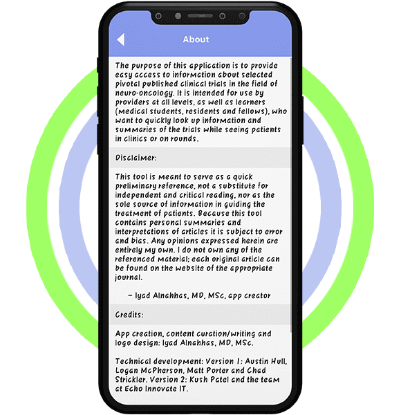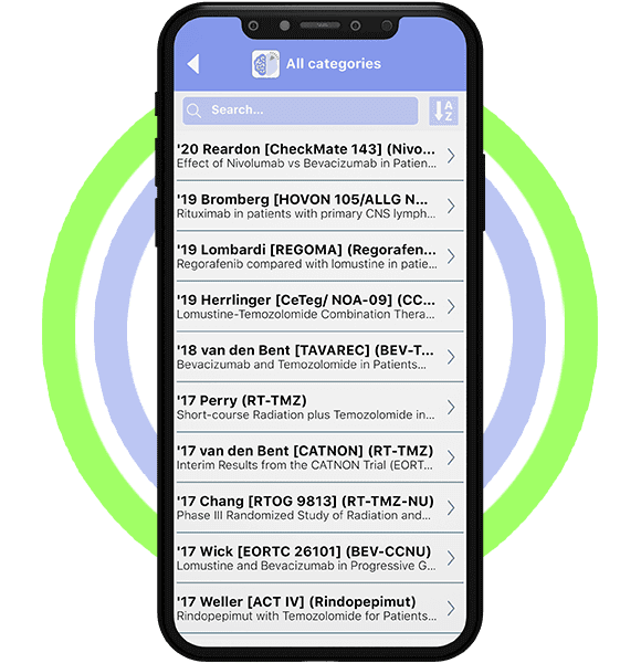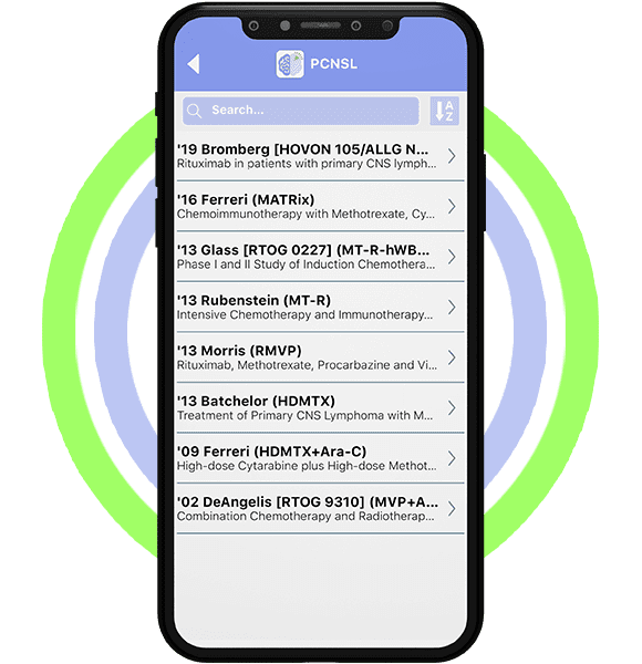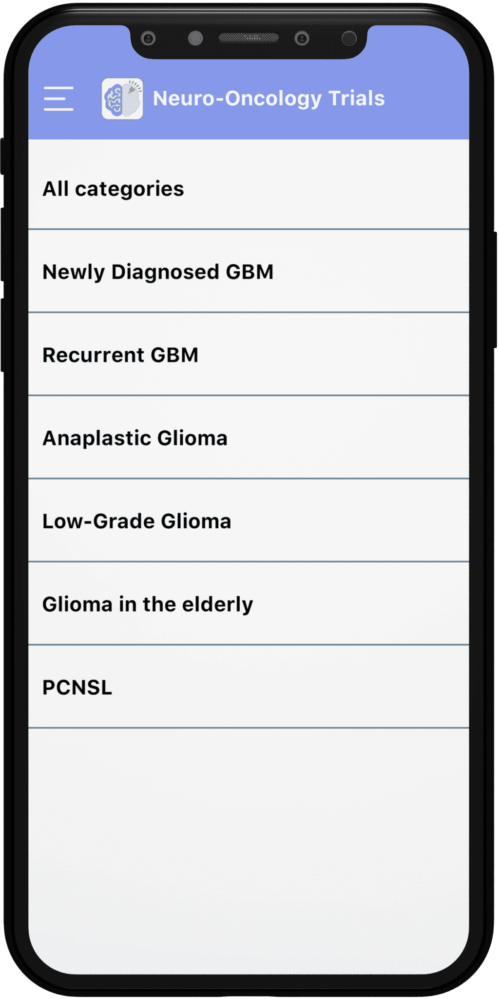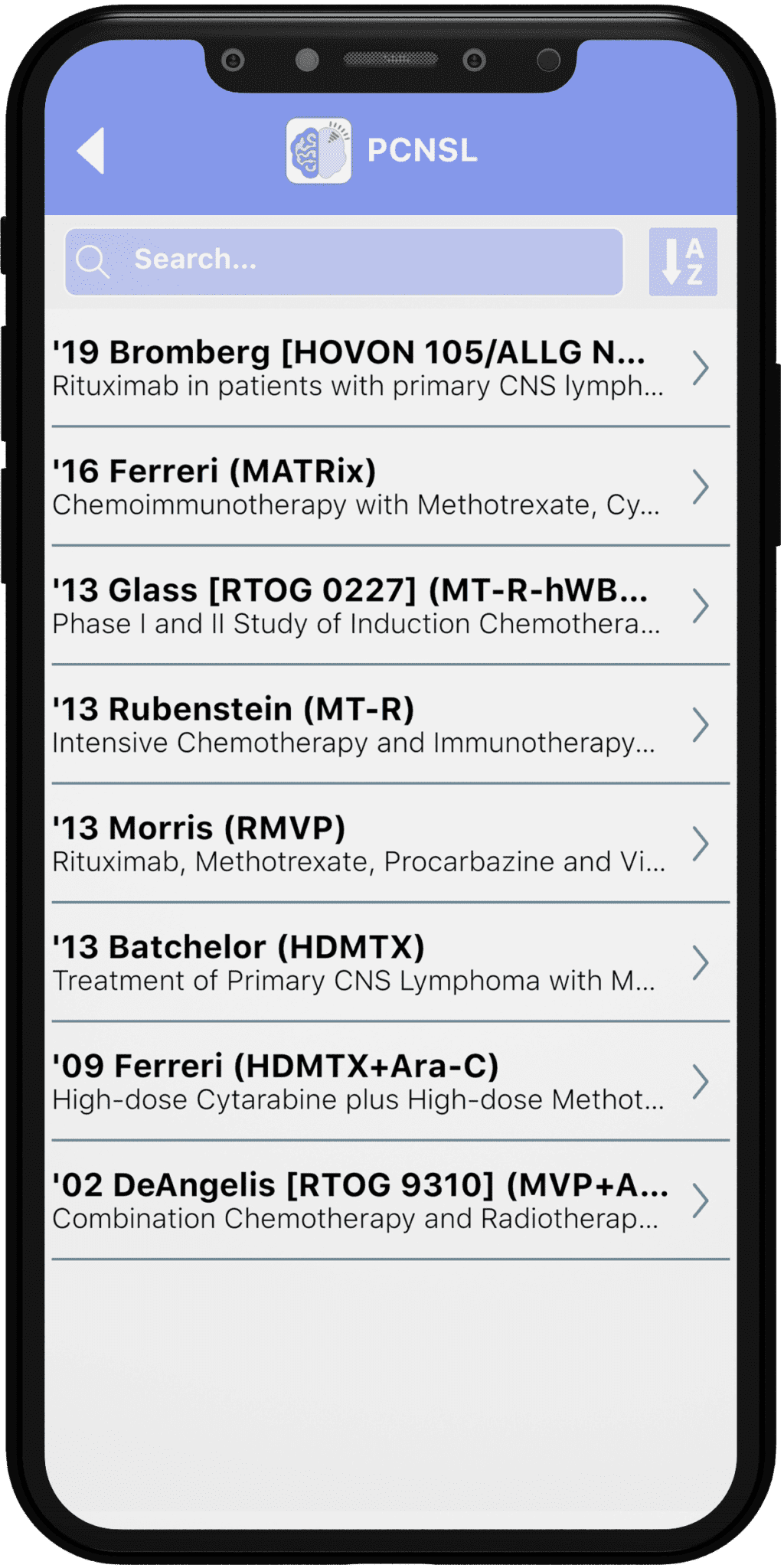

Results
We developed an application that has an auto-renewing membership and the content is refreshed every one to three months.
When making a purchase, your credit card will be charged if you do not cancel your membership before the conclusion of the three-day free trial period. Payment information will be validated at that time.
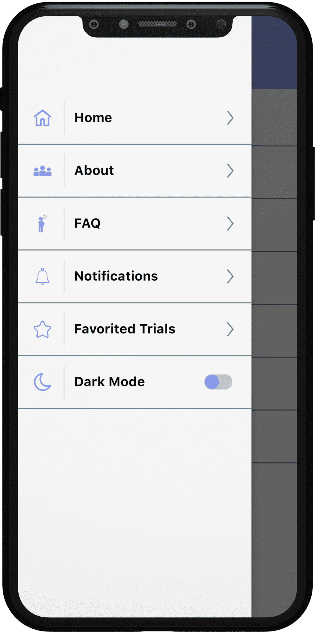
After making a purchase, users can manage their subscriptions and off auto-renewal by navigating to their account settings.
What clinicians and students expect from a medical reference app
Medical reference apps exist to answer a clinical question fast, often between patients or on a ward round. The content has to be accurate, well sourced and quick to scan on a phone.
Apps in this category usually serve students, residents, fellows and practising specialists. Each group reads differently, from a quick summary before rounds to a full citation for a journal club.
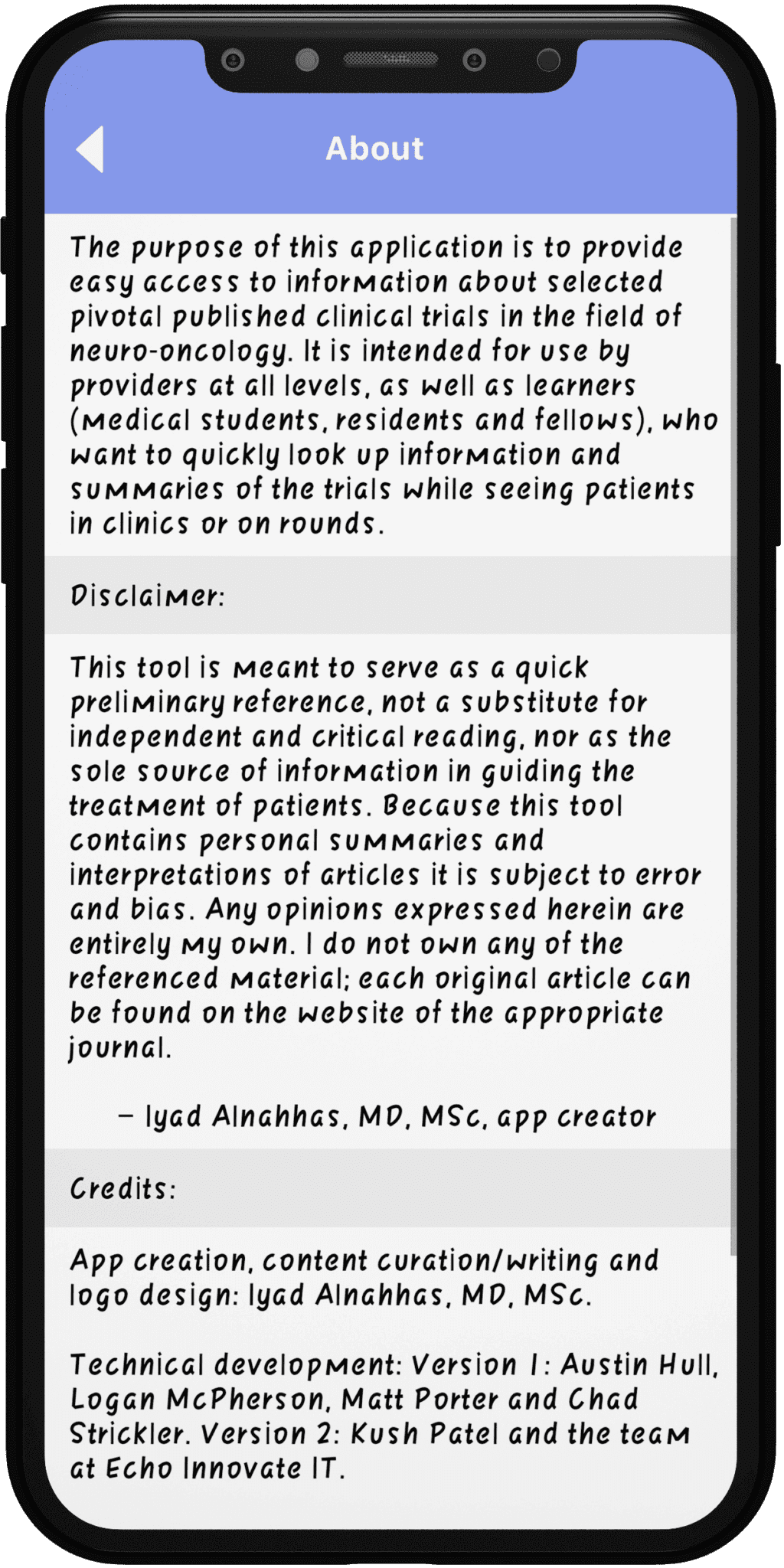
Trust is the deciding factor. Clear sourcing, visible review dates and a simple way to report an error tell readers the content is maintained with care.
Features a clinical reference app usually needs
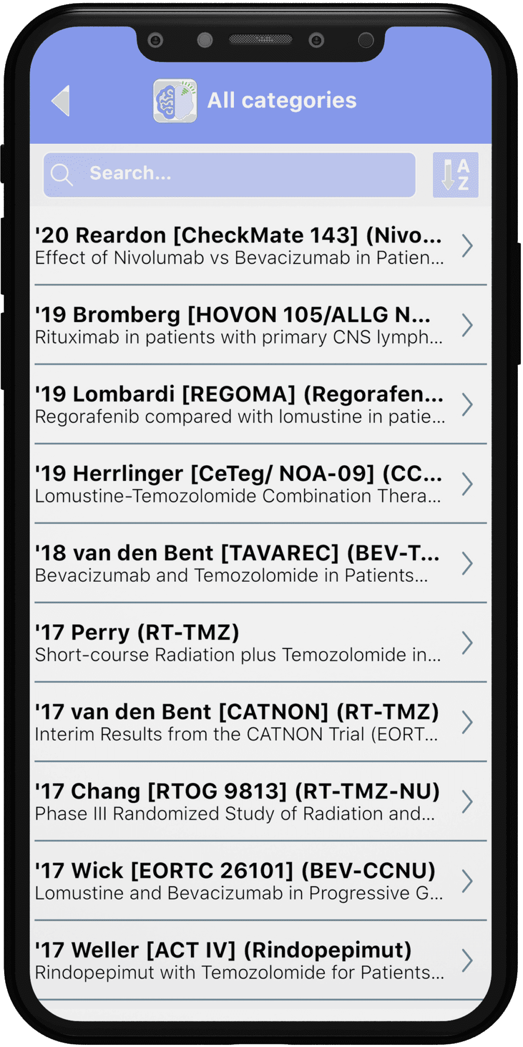
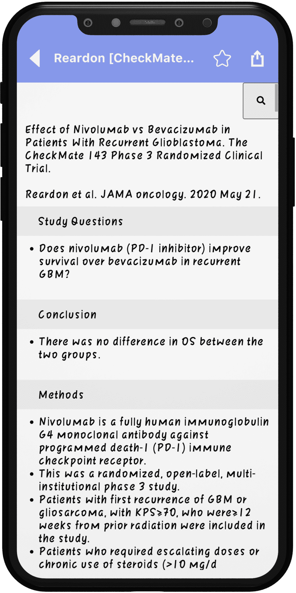
- Structured summaries – each study or topic laid out in the same order, so readers know where to look.
- Fast search – lookup by condition, drug, author, journal or trial name, with results ranked by relevance.
- Filters and categories – browse by disease area, phase or study type when you don’t know the exact term.
- Citations and source links – full references so users can go to the original paper.
- Bookmarks and notes – save key items for teaching sessions, exams or patient discussions.
- Offline access – content stored on the device for hospitals with weak signal.
- Content updates – new entries pushed to the app without a full store release.
- Sharing – send an entry to a colleague by message or email in a couple of taps.
- Subscriptions and trials – managed through the app stores, with clear terms and easy cancellation.
Build considerations for medical content apps
An editorial back end is the core of the product. Medical editors need to add, review and publish entries, with version history and a sign-off step before anything goes live.
Search quality makes or breaks a reference tool. Synonyms, abbreviations and spelling variants of drug and disease names should all lead to the right entry.
Native iOS and Android apps give the smoothest reading experience and reliable offline storage. A shared backend and content API keep both platforms in step with the same source of truth.
Subscriptions sold in a mobile app normally go through the store’s own billing. Restoring purchases, handling renewals and showing clear terms reduce support requests and review problems.
Accessibility matters for long reading sessions. Adjustable text size, dark mode and screen reader support help readers on night shifts and those with visual impairments.
Analytics should be light and privacy-friendly. Knowing which topics people search for shows the editorial team where to add or update content next.
Writing content that reads well on a phone
Short entries with consistent headings inside each summary help readers scan on a small screen. Key results, study design and limitations should each have a fixed place.
Tables need special care on mobile. Wide comparison tables often work better as stacked cards or a swipe view than as a grid that forces sideways scrolling.
Abbreviations are common in clinical writing, so a built-in glossary saves time. Tapping a term to see its full form keeps readers in the flow instead of sending them to another app.
Keeping the library trustworthy over time
Every entry benefits from a visible review status and the name of the reviewing team. Readers can then judge how current the material is before they rely on it.
A feedback button on each entry lets users flag errors or suggest new studies. Those reports should land in the editors’ queue, not in a general inbox.
What to plan before you start
Agree who writes, reviews and approves content, and how often it will be refreshed. The editorial workflow shapes the back end as much as the app screens.
Start with one specialty and a well-defined set of entries for the MVP. More specialties, quizzes or continuing education features can follow once readers rely on the core library.
Budget usually sits in one of three tiers: a lean reader app with search, a fuller product with offline mode and subscriptions, or a multi-specialty platform with an advanced editorial system. A scoping session clarifies which tier matches the content plan.
Timelines depend on how much content exists at launch, the search depth and the billing setup. Allow time for medical review of the final content and for store review.
After launch, budget for editorial updates, hosting and app updates as store rules and phone systems change. A reference app is only as useful as its latest review.
Planning something similar?
EchoInnovate IT builds apps for healthcare and education teams, backed by a team of 50+ people. Read more about our healthcare app development and education app development work. We start with a short scoping call about your content and readers, then provide a fixed quote.