Results
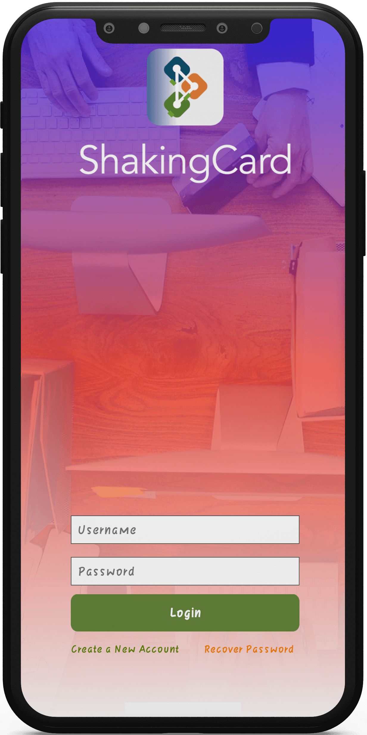
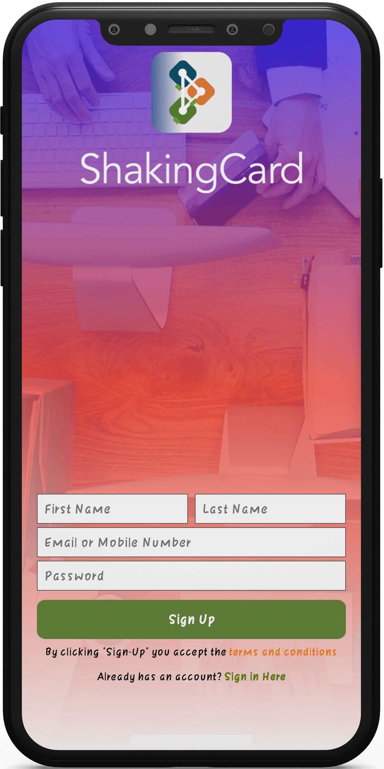
Shake has created its product to go above and beyond meeting demands that businesses and business people didn’t realize they required, in addition to taking into account the necessities in a proper Business Card App Solution
Why professionals move to digital business cards
Paper cards get lost in pockets, go out of date after a job change and run out at the worst moment. A digital card app fixes this by keeping contact details live on the phone people already carry.
Apps in this category serve sales teams, consultants, founders, recruiters and anyone who meets new people every week. Their main job is to make the first exchange quick and the follow-up easy.
For a company, a shared card system also keeps branding consistent. Every staff card can follow the same layout, logo and colours, and nobody waits for a print run after a promotion.
Features a digital business card app usually needs
- Card designer – templates, logo upload, fonts and colour choices, so a user can build a tidy card in a few minutes.
- Quick exchange – sharing by QR code, link, NFC tap or a phone gesture, so two people can swap details on the spot.
- Live contact updates – a new phone number or job title reaches everyone who saved the card, with no reprint.
- Contact book with search – saved cards sorted by name, company or tag, with fast lookup when a name slips your mind.
- Meeting context – a short note, time and place attached to each exchange, so you remember why you met.
- Tap-to-act details – phone numbers open the dialler, addresses open maps and email addresses open a fresh message.
- Team accounts – an admin adds staff, applies company templates and removes people who leave.
- Export and sync – contacts move to the phone’s address book or a sales CRM without retyping.
- Privacy controls – users pick which details each card shows and can withdraw a card they shared.
Who tends to use a digital card app
- Sales and business development teams – they meet prospects at events and need every contact saved before the day ends.
- Agencies and consultancies – staff change roles often, and cards must keep pace without a reprint.
- Recruiters and hiring managers – they swap details with candidates in person and want a clean record of each meeting.
- Event and trade show organisers – they can offer cards as part of the attendee experience.
- Freelancers and solo founders – a single card with a portfolio link replaces several printed versions.
Measuring whether the app is working
Useful signals are simple: how many cards are shared each week, how many get saved by the receiver and how many lead to a follow-up. These numbers show whether the core exchange is doing its job.
For team accounts, admins usually want to see which staff share cards and which templates are in use. A small dashboard covers this without turning the app into a reporting tool.
Feedback from early users is worth more than any metric in the first months. A short in-app prompt after the tenth exchange often surfaces the friction points that analytics miss.
How people judge a card-sharing app
Users decide in the first meeting whether the app is worth keeping. If the exchange takes longer than handing over paper, they go back to paper.
The person receiving the card matters as much as the sender. A good app lets someone without the app open the card in a browser and save it in one tap.
Small details build trust, such as a clean card preview, a clear confirmation after sharing and no surprise sign-up walls. These choices often matter more than a long feature list.
Build considerations for a card-sharing app
Most card apps need iOS and Android from day one, because the two people swapping cards may use different phones. A cross-platform framework can cover both from one codebase, while native code suits heavy use of NFC or motion sensors.
Gesture-based sharing, such as a shake, depends on motion sensors and nearby-device detection. These features need careful testing on many handsets, because sensor behaviour differs between models.
Contact data is personal data, so encryption in transit and at rest is the baseline. Clear consent screens and a simple way to delete an account help with privacy rules in most regions.
Integrations often decide whether a business adopts the app at all. Common ones are phone contacts, calendar apps, email tools and CRMs, each with its own permissions and sync rules.
The card editor needs a light content management layer behind it. Templates, brand assets and default fields should be editable by an admin without a new app release.
Accessibility matters on a product that is mostly text. Cards should work with screen readers, respect larger system font sizes and keep enough colour contrast between names and backgrounds.
Before launch, both app stores look closely at permission requests. Explaining plainly why the app needs contacts, location or motion access helps the review and builds user trust.
Design tips for the card itself
A digital card is read on a small screen, often in a hurry. Name, role and company should be visible without scrolling, with secondary links placed lower down.
Templates work best when they limit choices on purpose. A few well-spaced layouts with brand colours look more professional than a blank canvas with every option open.
Photos and logos need sensible size limits and automatic cropping. That keeps cards fast to load at a busy event where the signal is weak.
Dark mode, right-to-left languages and long names are easy to forget in early designs. Testing cards with real names and job titles from different regions catches layout breaks before users see them.
Common pitfalls to avoid
- Too many sharing methods at once – each one needs its own testing, so launch with the two people will use most.
- A complex editor – if designing a card feels like using a design tool, many users stop halfway.
- Forced sign-up for receivers – asking the other person to install an app before they can see a card kills the exchange.
- Weak offline handling – events and trade shows often have poor signal, so cards should share and save without a connection.
- Ignoring data export – businesses want to keep their contacts if they ever switch tools.
What to plan before you start
Start by naming the one exchange the app must get right, then build an MVP around it. Extras like analytics, team billing or CRM sync can follow once real people use the core flow.
Decide early whether the product targets individuals, companies or both. Team features add admin screens, roles and billing logic, which change the scope a lot.
Budget usually falls into three tiers: a lean MVP on one platform, a two-platform launch with team accounts, or a full product with integrations and an admin portal. A short scoping session shows which tier fits your plans.
Timelines depend on the number of sharing methods, the integrations and how much design work the card editor needs. Leave room for device testing and for app store review.
After launch, plan for regular updates as phone operating systems change. Sensor, NFC and contact permissions shift between OS versions, so maintenance belongs in the running budget.
Planning something similar?
EchoInnovate IT has built mobile products for over 12 years and has shipped 500+ products. Our mobile app development and cross-platform app development teams can help you shape a networking or card-sharing app. We usually begin with a short scoping call about your users and sharing flow, then send you a fixed quote.