
Responsive Design vs Mobile-Friendly Website Designs in 2025: What Every Business Must Know
In 2025, with more than 80% of online traffic in the USA coming from mobile devices, choosing between responsive design and mobile-friendly website designs (or mobile-specific sites/apps) is no longer just a technical luxury—it’s a competitive necessity. Businesses building Android apps, iOS apps, or web portals must understand that how your website adapts to mobile devices directly impacts SEO, user experience (UX), conversion rates, and brand trust. Responsive design and mobile-friendly layouts influence Core Web Vitals, bounce rate, mobile usability, and even app discoverability when content is shared across platforms. This article compares responsive vs mobile-friendly designs, examines their pros/cons, aligns them with modern tech trends (including app integration, voice search, AR/VR), and offers guidance for businesses (B2B & B2C) in the USA on making the right design choice.
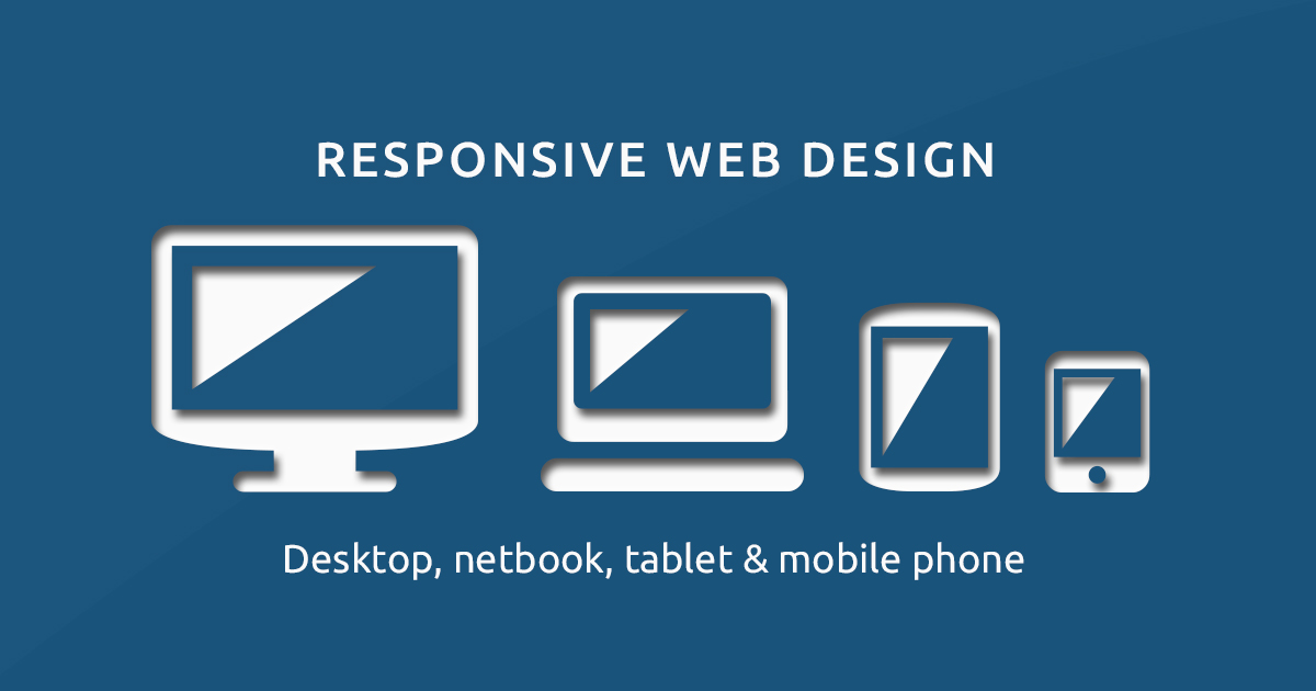
What Does “Responsive” vs “Mobile-Friendly” Really Mean?
Responsive design refers to websites that dynamically adapt layout, images, navigation, and content to the screen size—be it a large desktop monitor, a tablet, or a small phone (Android, iOS). It uses fluid grids, flexible images, CSS media queries to ensure that content reorganizes and resizes depending on device width, orientation, and resolution. In contrast, mobile-friendly or mobile-specific designs often mean simpler layouts optimized for mobile devices, sometimes even fully separate versions (or templates) specifically for phones. Mobile-friendly design may limit or change certain features (e.g. drop-down menus, hover effects) to ensure usability on touchscreens, but may not always alter content dynamically like responsive design does.
Why Responsive Design Often Wins in 2025 (for Web & Mobile UX)
One major advantage of responsive design is consistency—users experience the brand uniformly whether they browse via desktop browser, Android app web view, or iOS Safari. Responsive sites tend to perform better with Google’s mobile-first indexing, so pages built responsively often enjoy better rankings in mobile SERPs. They typically have lower maintenance costs—only one code base, one set of templates, one set of content to update. With modern frontend frameworks (React, Vue, Angular) plus server side rendering (SSR), headless CMS, and performance optimizations (lazy loading, image compression, adaptive assets), responsive designs can deliver excellent speed, small payloads, and great UX across devices. These help satisfy Core Web Vitals (LCP, FID, CLS), reduce bounce rates, improve session duration, and ultimately favor higher conversions.
When a Mobile-Friendly or Mobile-Specific Design Makes Sense
There are scenarios where a mobile-friendly or mobile-specific approach might be preferable or necessary. For example, apps or businesses with very different mobile vs desktop user journeys—where mobile users need very simplified navigation, limited content, or fast actions (e.g. ride-hailing, on-demand delivery)—might benefit from mobile-first templates or even mobile-specific site versions. Similarly, if a brand has both a native Android/iOS app and a web presence, they might use mobile-friendly landing pages or lightweight views to feed traffic into the app (app deep linking, deferred deep linking). Also, businesses that serve regions with consistently low bandwidth may choose simpler mobile-friendly layouts to reduce data usage and improve load times.
Key Benefits & SEO Advantages of Responsive Design vs Mobile-Friendly Sites
Better User Experience (UX) on All Devices: Responsive design ensures clean layouts, readable fonts, easy navigation, no horizontal scrolling, touch-friendly buttons—vital for mobile apps, app store previews, mobile-web views in Android/iOS apps.
Improved SEO & Higher Ranking Signals: Google rewards mobile-readiness; sites that are responsive tend to avoid duplicate content issues (which can arise with separate mobile sites), and they perform better under Core Web Vitals. A fast mobile page < 2-3 seconds load, minimal layout shift, and responsive images matter.
Lower Maintenance & Unified Content Strategy: One site to update, one SEO strategy, easier content updates, easier management of meta tags, structured data, site maps.
Better Conversion Rates Across Devices: Whether users access via mobile web, tablets, or embedded web views inside Android/iOS apps, a site that adapts responsively reduces friction—users complete actions, fill forms, make purchases more easily.
Enhanced Mobile App / Progressive Web App (PWA) Integration: Responsive web design complements PWA strategies and app store optimization (ASO). PWAs and mobile web views benefit from responsive foundations.
Emerging 2025 Trends That Change the Design Equation
Progressive Web Apps (PWAs) & Hybrid Apps: Many businesses now deploy PWAs and hybrid apps (React Native, Flutter) that mimic native Android/iOS app behavior. Responsive web content ensures those apps or web views load seamlessly.
Voice Search & Conversational UI: Queries like “best responsive design vs mobile friendly”, “how to design website for Android app integration”, “how responsive is my site” are increasing. Designs must consider voice search readiness, structured data, FAQs designed for voice queries.
Foldable Devices, Large Screen Phones & Tablets: Devices with varying aspect ratios (foldables, dual screens) require fluid responsive designs more than ever—layouts must adapt gracefully.
AR/VR & Immersive Web: Web experiences that integrate AR/VR, 3D content, or WebGL elements are more likely embedded via responsive web versions; mobile-friendly design must support or degrade gracefully.
Performance Optimization via “Edge” & CDNs: Using edge caching, serverless functions, dynamic image resizing helps responsive sites deliver fast mobile experiences. Mobile apps with embedded web content also benefit.
Privacy & Consent UI Considerations: Mobile users are sensitive to permissions, intrusive pop-ups, cookie banners. Responsive design must include clear consent flows, user control, privacy-first design.
Recommendations: How to Choose and Implement the Right Design Strategy
For businesses deciding between responsive design and mobile-friendly or mobile-specific layouts in 2025, consider the following:
Audit your user data & priorities: Analyze analytics to see what percentage of users come from mobile (Android, iOS); assess traffic sources, bounce rates, session duration; identify top user actions on mobile vs desktop.
Define core user tasks: If mobile users mostly make simpler transactions (search, order, browse), mobile-specific views may simplify flows. If users do many desktop-class tasks (e.g., content consumption, data input), responsive design ensures usability across devices.
Leverage responsive frameworks & component libraries: Use modern CSS frameworks, responsive grids, adaptable images, viewport breakpoints, fluid layouts. Prioritize performance: lazy loading, adaptive image formats (WebP, AVIF), minimal JavaScript, critical CSS.
Optimize for Core Web Vitals and mobile performance: Focus on Largest Contentful Paint (LCP), First Input Delay (FID), Cumulative Layout Shift (CLS), mobile page speed, mobile navigation, touch targets, loading strategy.
Use structured data, schema markup, and SEO best practices: Mobile app schema, SoftwareApplication, Breadcrumbs, Article schema, HowTo/FAQ schema. Ensure metadata is shared across devices. Use canonical tags properly if you have separate mobile site.
Test across devices, screen sizes & network conditions: Use emulators, real devices, test on 3G/4G/5G, check foldables, tablets. Use performance tools (Lighthouse, WebPageTest).
Plan for future growth & trends: Will you need AR/VR, PWAs, offline features, push notifications, integrations with Android/iOS apps? Designing responsively ensures flexibility.
Conclusion
Today’s digital environment demands that businesses deliver seamless, fast, and unified experiences across mobile, tablet, desktop, and within app views. In 2025, responsive design is usually the safer, more sustainable choice—especially for companies serving USA-based users, integrating with Android apps, iOS apps, or deploying hybrid/hybrid-web strategies. However, in specific contexts—if mobile tasks are very different from desktop ones, or resources are limited—a mobile-friendly or mobile-specific solution may be practical. Ultimately, the best choice hinges on your audience, usage patterns, performance priorities, and long-term architecture plans. When done well, responsive design boosts SEO, user engagement, retention, and conversions, while reducing maintenance overhead.
Website designs have become increasingly important in today’s digital landscape. It is crucial to exercise caution when selecting and creating a website, as even a single incorrect decision can lead to undesired outcomes. Therefore, it is essential to conduct thorough research before implementation. In this article, we will compare responsive web design and mobile-friendly website design, highlighting their respective strengths and weaknesses.
A responsive website is one that changes according to the size of the device screen. It features dynamic changing content, optimized images, and the correct spacing depending on the device, and is dependent on mobile operating and mobile optimizing systems functionality.
With a responsive design, text and images change from a three-column layout to suit the screen of your device perfectly.
If you’re on a website on the desktop and want to see if it is sensible, simply reduce the size of the window and see if the display changes to match the size of the window. websites sensitive react with the user in mind and improve usability no matter what the device.
A mobile-friendly website maintains consistent functionality across devices and search engines, as the design is not altered. Only the site’s scale may differ. However, some features, like drop-down navigation menus, are limited due to their difficulty of use on mobile devices.
Advantages Of Responsive Design And Mobile Friendly Design
Lesser Text
The responsive theme design needs lesser text to describe the content. The content is the design itself. If your website design is responsive then text won’t be a thing to worry about for you.
Lesser Load Time
We all want to provide a good user experience. And one of the reasons why people leave the fastest website is due to its long charging time.
Mobile-optimized sites load faster so it is a step away from losing a potential customer.
More Number Of Visitors
79% of people who do not like what they find on a site are going to go back and look elsewhere. Half of the users need a mobile-friendly website to engage with your business.
Many mobile users simply click off a page if they do not respond the way they want on a mobile device.
SEO Benefits
Another reason why you need a mobile-optimized site is that it makes it easier for people who are searching online.
Google announced that on April 21, 2015, its new algorithm favors sensible mobile websites. In addition, this way you will not be penalized for having duplicate content.
Lower Maintenance Cost
A mobile website that answers can cost upfront but is certainly much lower maintenance costs. For example, it is not necessary to reformat, duplicate or add features to its content twice, just as you would using a desktop computer and a mobile site.
Consult some services virtual assistant websites techniques – that will help you transform your website and optimize it for the mobile version.
Better Online Browsing
If someone visits a website for the first time from their desktop or smartphone, you want them to have a consistently positive experience. If visitors have to do a lot of zooms, shrink and pinch their screens during their first visit, they tend to give up and try another website.
Better Offline Browsing
Now that many smartphones and tablets are compatible with HTML5, responsive website design benefits users. This makes it easier to continue displaying content within the HTML5 web applications without an Internet connection.
Lower Bounce Rates
Optimized sensitivity and offers a better user experience for mobile site visitors. Therefore, it is much more likely that they will stay for a longer period of time and explore different areas of your site.
Alternatively, if your site is not sensible, it is much harder to keep the visitor engaged, and thus more likely it is going to bounce.
Better Conversion Rates
Reducing your bounce rate is only half the battle. Consistent user experience across all devices helps in gaining more users.
When users are deciding whether or not to subscribe to a service that does not want to be redirected to a specific website’s device because the process often takes longer.
A single secure website that looks professional on all platforms is enough to not make users frustrated or turn to a competitor.
Lower Maintenance Needs
Having a separate mobile site requires additional testing and support. By contrast, the design process response uses standardized testing methodologies to ensure optimal design on all screens.
Response design “one size fits all” means fewer headaches for developers, business owners, and consumers. Spend less time on maintenance also frees up time to focus on more important things like marketing and content creation
A SWOT Analysis To Solve The Riddle Of Responsive Design v/s Mobile-Friendly Website Design
- It is very much true that our regular PC is going to die a mournful death in the near future because it is getting complicated. Here is the analysis of responsive web design v/s mobile-friendly web design.
- Other platforms like Tablets or I-Pads are not consistent when it comes to market penetration and bigger stakes in the pie of the internet.
- The only segment where the world is going to access the internet is going to be smartphones.
- In a condition like this if you are planning to develop real estate in a virtual world then it is important for you to select the right kind of vehicle for your endeavors.
- Mobile screens are certainly going to lead in the future, however, when we weigh them on the scale of now then we find that the small screen of the mobile is still winning the trust levels of information-hungry consumers.
- PC’s has done a kind of classical conditioning of old users. New users, however, are more familiar with Mobile screens.
Think About It From The Perspective Of An Entrepreneur
Now, what do you think, as an entrepreneur seeking to set up a business on an internet platform, your options are clear, you can go for mobile websites and be with the future?
Undoubtedly, the decision between mobile-specific designs and responsive designs is not a simple one. While web development service providers may find it easier to weigh the pros and cons of each option, the selection process requires careful consideration. Therefore, it is important to use appropriate transition words to guide readers through the comparison and contrast of these two website design approaches.
However, what they are sharing with you is not the complete picture.
They are comparing tools. As an entrepreneur, you need to see it from the perspective of a process.
Here we are highlighting some major comparisons that can help you in making a swift decision related to the selection of responsive design or a mobile-specific design.
What Is The Status Of SEO Exercise For You? Where Exactly You Want To Display Yourself?

Responsive web designs are universal designs when we compare them with mobile-specific designs. Hence, we can say that Mobile-specific designs carry this tag of “restricted” upon them because they are practically not visible on other mediums.
If they are visible then the distorted visuals and broken pages can damage your reputation and put a tag of lousy campaigner on you.
Check your SEO goals all over again if mobile screens are your main target area then a stand-alone mobile design can win the race of SEO for you with excellence.
Responsive designs on a mobile platform can perform on a slightly lower ranking.
If it is a cutthroat competition of numbers for you and mobile screens are your key result areas, then going for mobile design is always a better option.
On the other hand, if you are in a mode of retaining customers and adding a mobile screen as a convenience in the main bouquet of the events.
Then, tell the people offering web development services that you want a responsive website design.
Check Out The Showbiz Quotient Of Your Business
Web development services providers often find themselves in a fix when they come across some parties that are trying to make it big in the field of fashion and other showbiz venues.
Also, design and presentation matter because they are an integral part of the package.
Instead of going for responsive web designs, these pages should go for two separate web designs.
The reason is quite simple, responsive web designs have this limitation, they work on “common minimum platforms”. This means you might need to compromise on the aesthetics, latest functions, and the speed of the website.
In a condition like this, you can always maintain two separate web designs for normal or eCommerce designs. One specifically designed for mobile and another one that will be a responsive one.
Wrapped Up
Data update and other functions may cause you some trouble in the beginning. Finally, once things will get streamlined, you will not regret it by any standards.
If you have got your answer but you are yet to find out a responsible name for the web development solutions, you can write to us at info@echoinnovateit.com anytime!
FAQs Of Responsive Vs Mobile Friendly
What is the difference between responsive and adaptive web design?
What type of design should a website have to be mobile-friendly?
A mobile-friendly website works the same way regardless of the device and search engine. In other words, mobile-optimized designs do not change depending on the device used. Nothing changes in functionality than the scale of the site. Many great website features, such as drop-down navigation menus are limited because they can be difficult to use on mobile.
How do I make my website Responsive?
- Adopt a fluid grid
Allow for touchscreens
Decide what elements to include on small screens
Think about images
Try a pre-designed theme or layout
Outsource your project
Which company develops Responsive websites?
Echo innovate IT develops responsive websites. We have 12+ years of experience. As a custom mobile application development company, We manage the entire lifecycle of your product planning, strategy, and app/web launch, from UI / UX design, application development or Web development, QA testing to product delivery.
Echoinnovate IT Established in 2012 with 3 developers and a small cabin in Florida now we have 3 offices over the globe with 55+ Developers strengths,
We have developed more than 630+ projects in various industries. Our team of mobile app developers uses the latest technology to develop the highest mobile apps.
We ensure to provide the best services. Contact us now.
How do I make my website mobile friendly?
Audit your website for mobile-friendliness
Pick your best mobile-friendly solution
Use mobile SEO best practices
Avoid common mobile optimization mistakes
Use SEO tools to improve your ranking in mobile SERP
When is a mobile-specific site still justified over responsive design?
It might make sense when the site’s mobile users have very different needs from desktop users (e.g. highly simplified functionality), or when you need extreme performance under constrained network conditions, or in legacy scenarios where responsive redesign is not yet feasible. But the tradeoffs include higher maintenance, potential SEO drawbacks, and inconsistent user experience.
How often should I audit my site’s mobile usability and responsiveness?
Regular audits are important—after each major update, every time you add new features, or change your design. At minimum, do a thorough mobile/responsive usability audit every 3-6 months, especially when new device form factors or OS updates (Android/iOS) are released, or after Google algorithm or ranking factor shifts.
What schema or structured data helps improve SEO for responsive websites?
Use structured data types like SoftwareApplication / MobileApplication (if you have apps), BreadcrumbList, Article, FAQ, HowTo, Review, and LocalBusiness (if local coverage matters). Proper schema markup helps search engines understand content and display rich results like FAQs and featured snippets, which are beneficial for responsive and mobile sites.
What mistakes do businesses often make when implementing mobile-friendly or responsive designs that hurt SEO?
Common mistakes include: using huge uncompressed images, heavy scripts slowing the site, content hidden or inaccessible on mobile devices, poor navigation touch targets, not optimizing for Core Web Vitals, having separate mobile site with duplicate content, missing mobile SEO best practices, inconsistent cross-device user experience.